 FR
FR EN
EN armand.legros28@gmail.com
 Armand Legros

Arya – Smart Home 2050
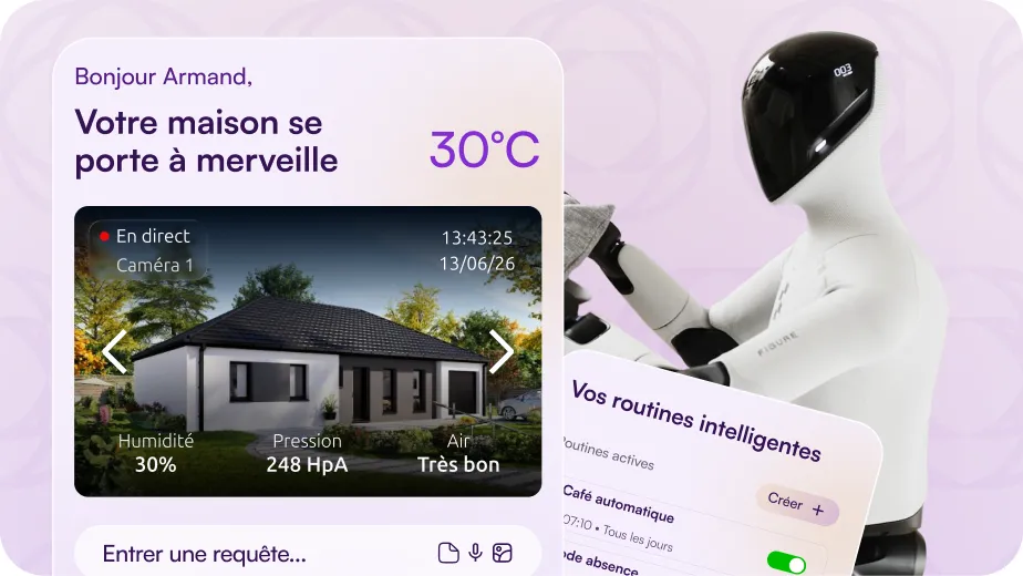
UX/UI concept: designing tomorrow's home automation app. The smart home already exists. The control centre does not...
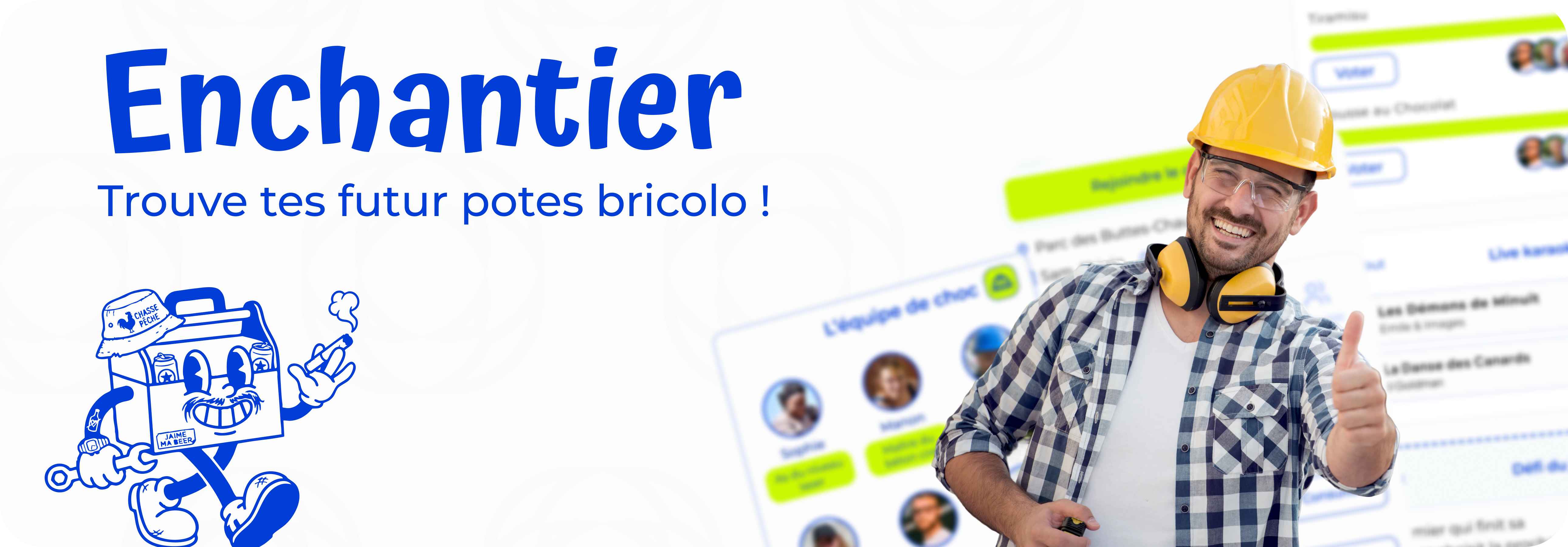
Helping hands in exchange for sausages.
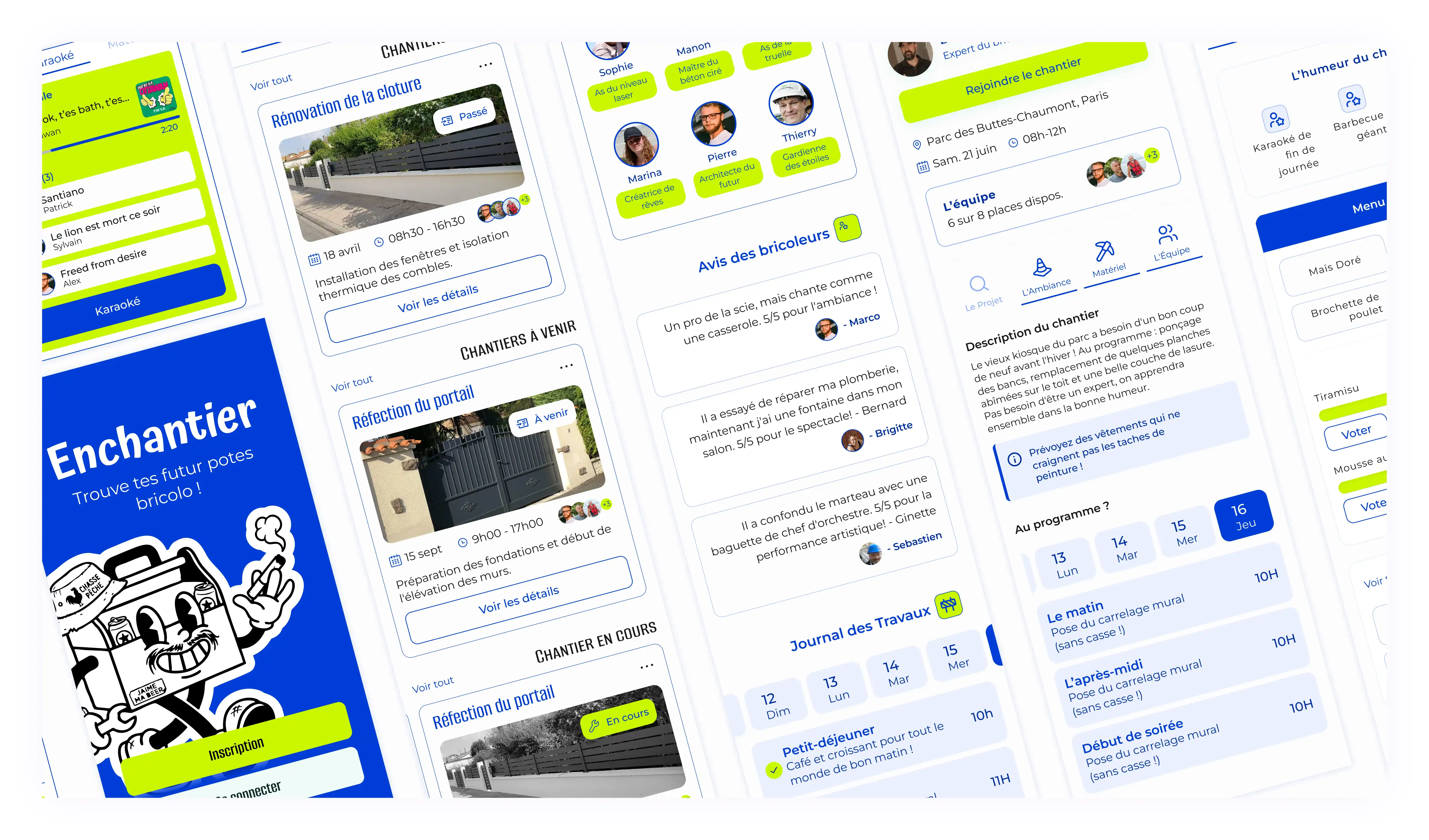
Enchantier connects homeowners who have renovation work to do with DIY enthusiasts looking for a great weekend vibe. No pay involved, just doing it together, a customisable BBQ, and a deliberately saboteur karaoke.
View prototype
The challenge was not to design a useful app. It was to design a deliberately flawed app, with real dark patterns and intentional anti-design choices, without the experience simply feeling broken. Creating friction without disrupting navigation, manipulating without losing the user: a balancing act we had never attempted before.


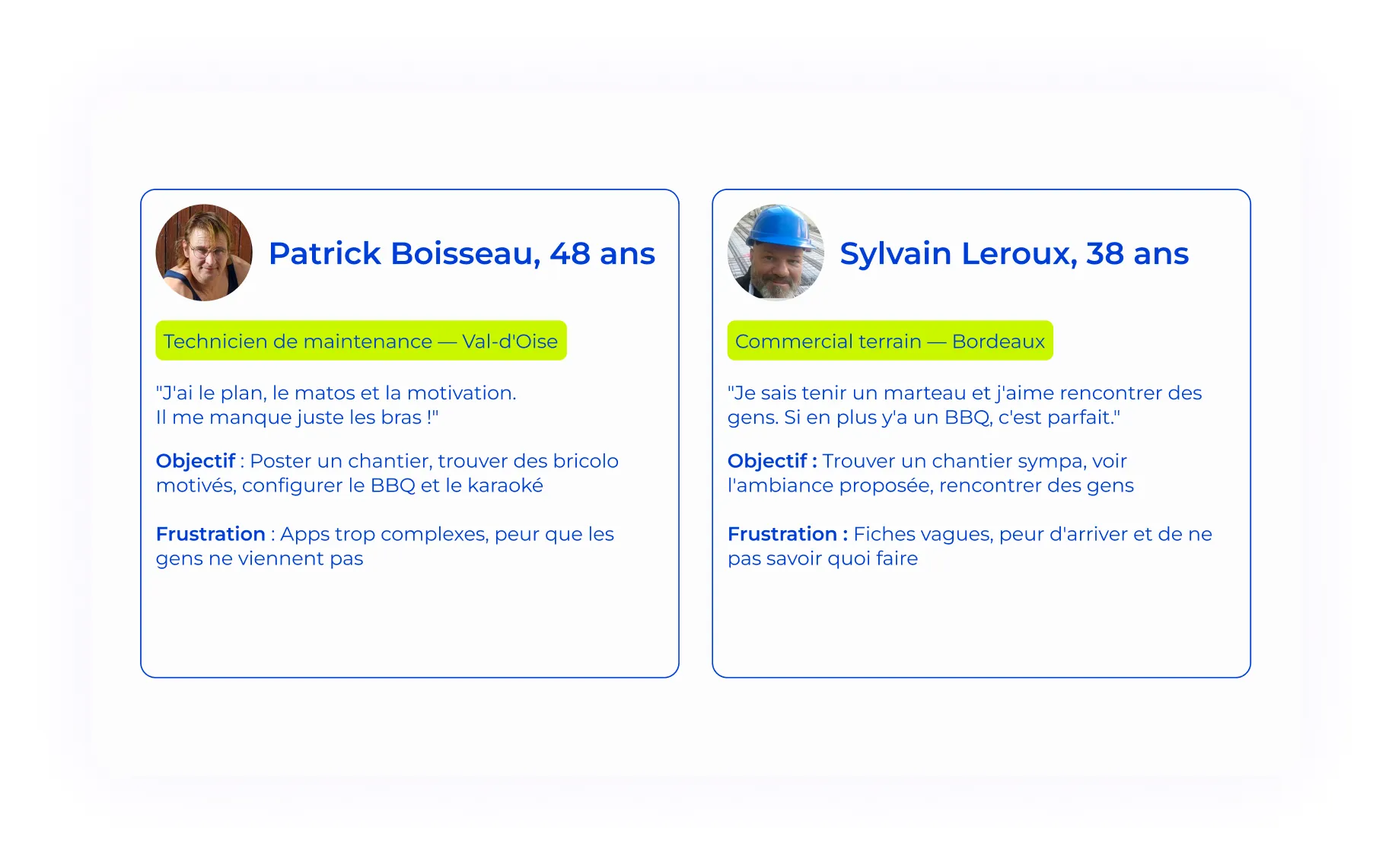
Two complementary profiles shaped the entire design process. Patrick, 48, wants to post his renovation project and find motivated helping hands — he needs simplicity. Sylvain, 38, is looking for an original social experience for his weekend — he wants the good vibes before the work starts. Both profiles share the same core value: doing it together, rather than alone. That common ground drove every interface decision.
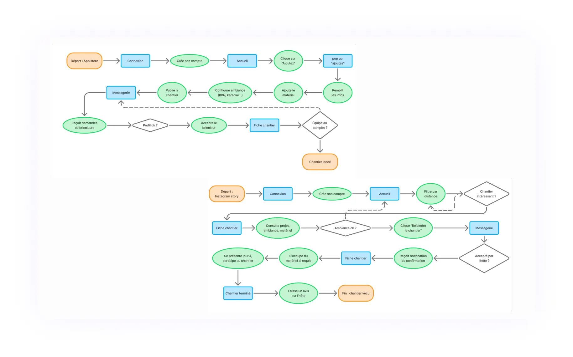
Two distinct journeys, one shared matching logic. The homeowner creates their project, configures the atmosphere (BBQ, karaoke, equipment), publishes it and receives applications. The DIY enthusiast filters by distance, browses the project listing, checks the proposed vibe, and sends their request. This dual journey helped anticipate friction points and validate key screens before moving into the visual phase.
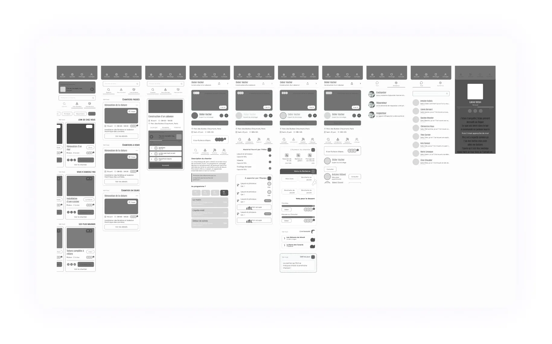
Wireframes were the decisive step for pushing past our classic UX reflexes. By laying out the architecture flat, home screen, project listing, messaging, project creation, karaoke space, we could identify where to place intentional friction without breaking the flow. This shared foundation also allowed us to split screens efficiently and work in parallel while maintaining overall coherence.
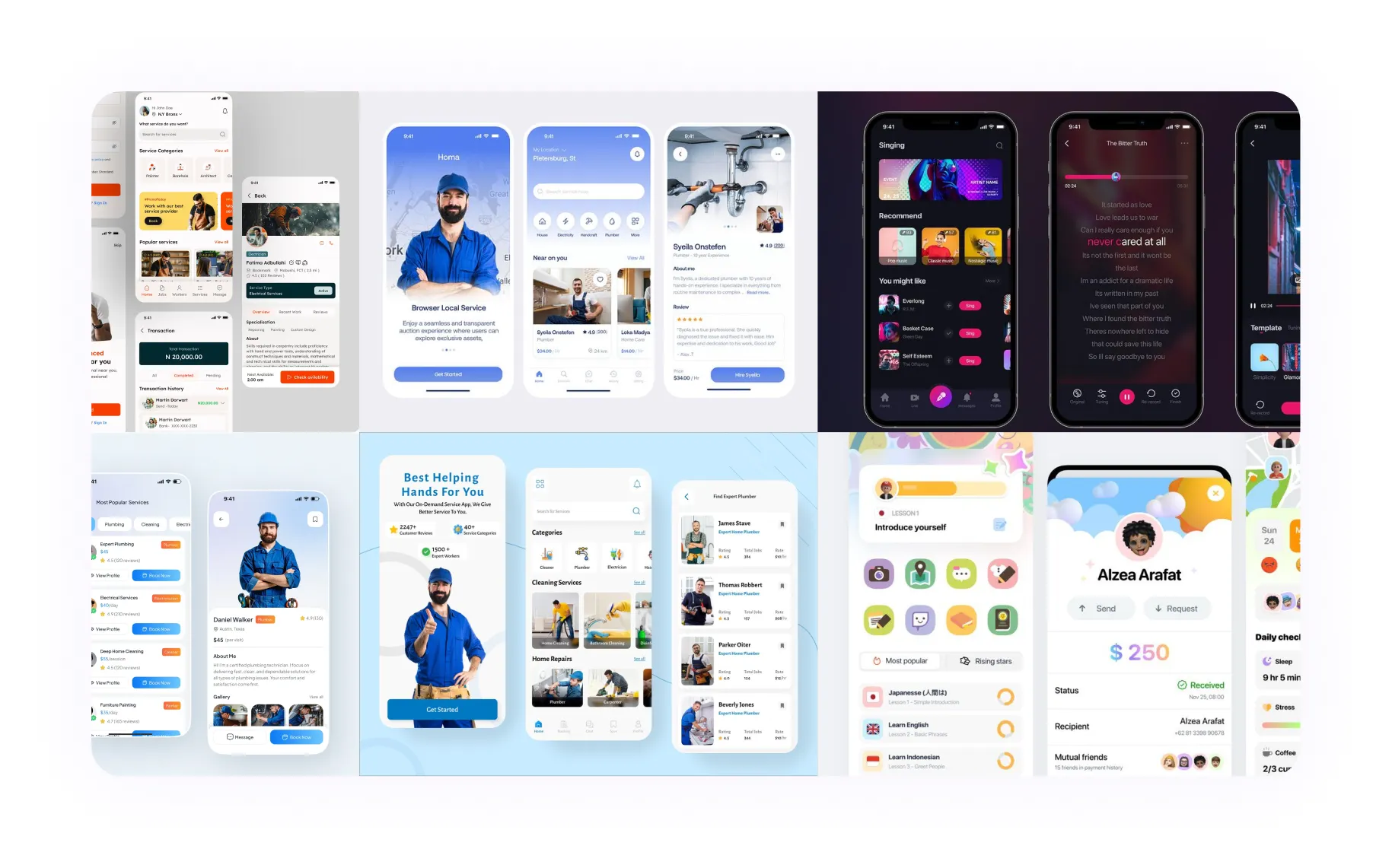
The benchmark analysed Leboncoin, Yoojo, AlloVoisins and TaskRabbit, all built around a cold transactional logic. Visual references (Pinterest, Dribbble) pointed towards modern mobile interfaces with a familiar card-based system. The objective was to build an interface users recognise in its structure, but that surprises them in tone and visual identity, energetic, off-beat, and proudly unpretentious.
A fully realised concept, presented at Creative Lab 2026 with Eliott Le Corre. The application features a consistent visual identity from start to finish, two documented and justified dark patterns, three intentional anti-design choices, all within an interface that non-expert users can genuinely navigate. The result: an app that is simultaneously absurd, recognisable and thoroughly considered.
UX/UI concept: designing tomorrow's home automation app. The smart home already exists. The control centre does not...
Full UX/UI design of a rap media platform centralising news, ticketing, live shows and participatory merch for a 16–35 audience.
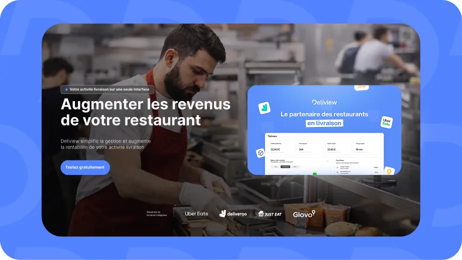
Landing page for a SaaS that consolidates Uber Eats, Deliveroo and Just Eat into a single interface to simplify orders for restaurant owners.
UX/UI Designer based in Angers & Co-Founder of Combo.
Open to full-time & work-study positions. I am eager to bring my vision and energy to an ambitious team.